Seneca student home
Rethinking the Student Portal: A Seneca Student Home Redesign

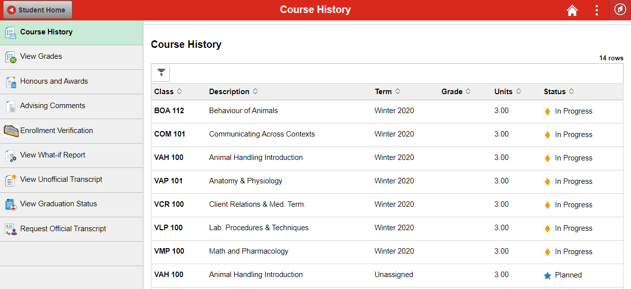
Seneca Student Home is the main portal students use to access everything from grades to tuition to schedules. The problem is it tries to do too much at once, and the result is a cluttered, hard-to-navigate experience that makes simple tasks feel harder than they should be. For my final project at Seneca Polytechnic, I took on a full redesign to see how much clearer it could be.
Timeline
13 weeks total. The first month was spent on research and discovery, the middle weeks on wireframing and structure, and the final five weeks on high-fidelity design and usability testing.
Background
This was an academic project, not a live brief, but I approached it the same way I would a real one. The goal was to strip back the noise, reorganize the information architecture, and surface the things students actually need on a daily basis.
I followed the same process I would on a real project: start with research, build a structure, iterate on designs, and test before calling it done.
Discovery & Audit
I started by spending time with the existing portal and identifying what was getting in the way. I ran surveys with students to understand which tasks they did most often and where they got stuck, and did a competitive audit to see how similar platforms handled the same problems.
Strategy & Structure
From the research I built out a revised information architecture, grouping tools into three clear categories: Academics, Finance, and Personal Records. I also mapped out user personas and journey maps for both new and returning students since their needs are pretty different.
Wireframing & Iteration
I explored multiple layout directions in wireframes before committing to a direction. I used AI tools including Claude to rapidly generate and pressure-test layout variations, which I then manually refined to get the grid and visual hierarchy where I wanted it. A lot of this phase was about finding the right balance between showing enough information upfront and not overwhelming the page.
Validation & Testing
Once the high-fidelity prototype was ready I ran usability testing through Maze. I wanted to see whether the decisions I made in the redesign actually held up when real people used it, not just in theory.


The redesign came down to three things: put the right information front and center, make navigation predictable, and reduce visual noise.
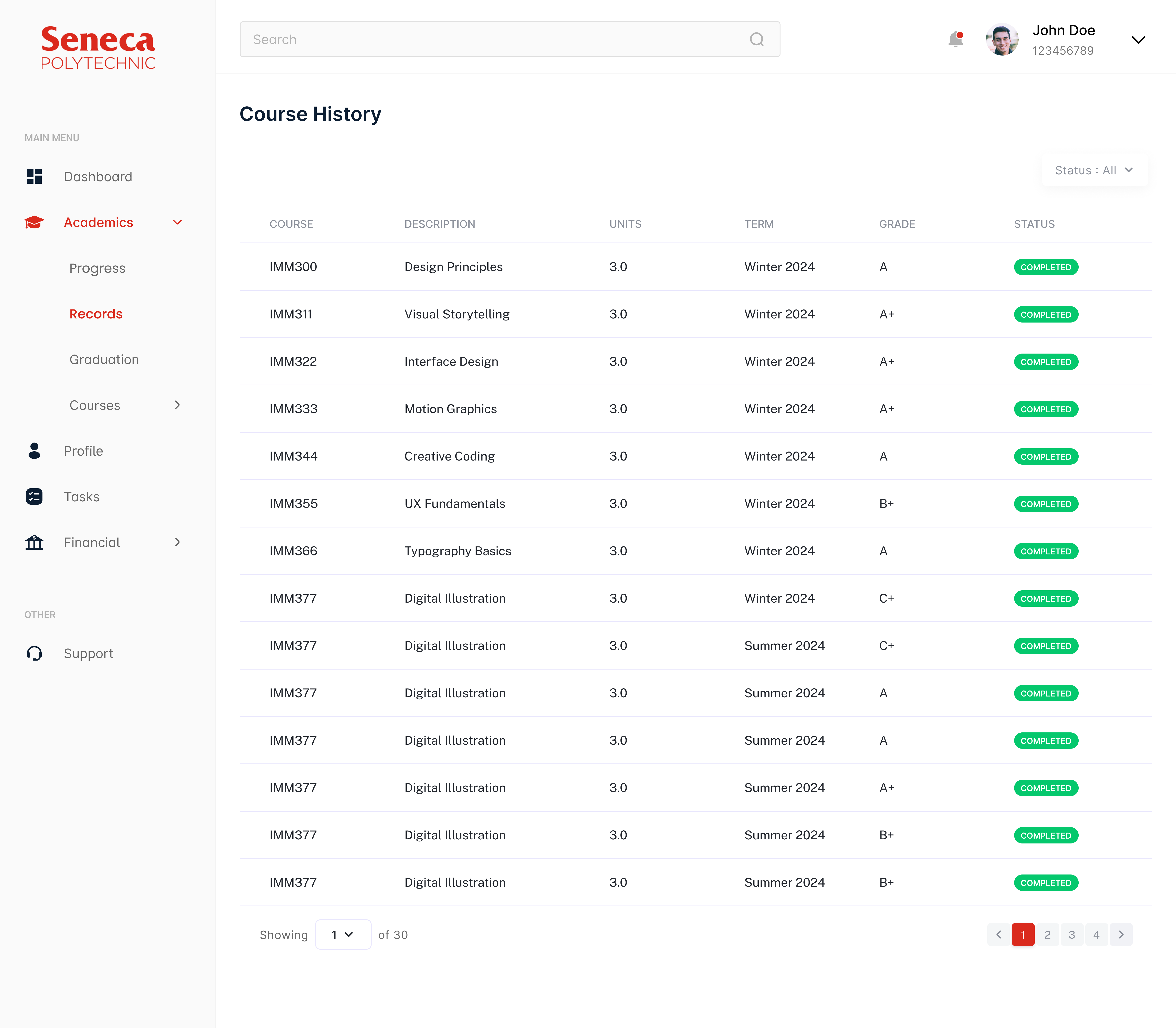
Centralized Dashboard
The new home screen surfaces the things students check most often: academic standing, upcoming schedules, and financial status. Instead of hunting through menus, everything critical is visible from the moment you land on the page.
Reorganized Navigation
I restructured the menu into three clear categories: Academics, Finance, and Personal Records. The goal was that a student should be able to predict where something lives without having to search for it.
Visual Clarity & Hierarchy
The layout uses a clean grid with clear typographic hierarchy so the eye knows where to go first. Deadlines and high-priority notifications are called out through color and spacing rather than buried in a list.


The Maze testing results were honestly better than I expected for a first round.
Increased Task Efficiency
100% of testers completed key tasks successfully. Students found their weekly schedule in 2.6 seconds and checked their grades in 3.6 seconds. For a portal that used to bury this information, that's a meaningful improvement.
Streamlined Financial Navigation
90% of testers navigated directly to their account information without taking a wrong turn, and not a single person gave up during the financial tasks. Consolidating tuition and fee information into one place made a bigger difference than I anticipated.
Enhanced User Satisfaction
Across the board, testers found the redesign cleaner and easier to use. 100% of them identified their academic standing within seconds of landing on the dashboard, which was the core goal of the centralized layout.